The screenshot is not a source
The screenshot has a bold number, a confident caption, and a moral. It is also, very often, wrong. A statistic does not become true because it appears in a meme, a podcast clip, or a tweet with thousands of likes. It is a summary of decisions: what to count, who to ask, how to define the category, and which comparison to make. Those decisions shape the number far more than most people realise. Before you share a manosphere statistic, you need to ask not “is this true?” but “where does this come from, and what did the original researcher actually measure?” The first question invites a gut reaction. The second question produces an answer you can verify. The most dangerous statistics are the ones that confirm what you already want to believe.
Find the original study and read the definition
The most shared manosphere numbers are often technically accurate and still deeply misleading. Take the claim that 63% of young men are single. It gets passed around as proof that women have abandoned dating, or that only a small elite of men get any attention. The survey behind the figure uses a specific definition of “single,” and the same data reports that 34% of young women are single. Those two numbers cannot both describe a dating market where women are rejecting men; the gap comes from how the question is asked, who is included in “young,” and what the researchers counted as a relationship. This is not pedantry. The difference between 63% and 34% changes the entire argument.
Look for the date and the population
Statistics age. A survey from 2005 says something about 2005, not about today. A study on American men says nothing about British men, or Japanese men, or men in rural areas. The manosphere often presents a single number as a timeless, universal truth. The truth is that most statistics are snapshots of a specific population at a specific moment. Before sharing, ask: who was surveyed, how many people, and when? If the answer is “a sample of 200 college students from one university in 2014,” then the number does not support a claim about all men and women everywhere. If the survey is from 1990, it says nothing about the current dating market. The easiest way to spot a bad statistic is to check whether it has a date and a population attached. If it does not, you are looking at a slogan, not a finding.
Check the baseline, the denominator, and the comparison group
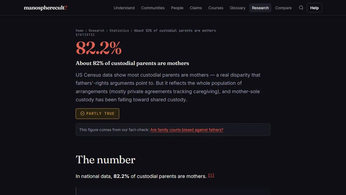
The second most common error is comparing a number to the wrong baseline. “Women initiate 69% of divorces” is real, but it does not tell you why women file, how many filings are mutual, or whether the reasons are gendered in the way the caption implies. “About 82% of custodial parents are mothers” is also real, but it is often used to claim that family courts are biased against fathers. The raw custodial parent statistic does not control for who asks for custody, who earns more, or how many fathers never file. A fact-checker’s job is to ask whether the statistic can support the sentence attached to it. The family court bias claim walks through what the custody numbers can and cannot show. The same test applies to “men are 92% of workplace deaths”: true, but the denominator is all workplace deaths, not all workers, and men hold most of the dangerous jobs. Rates per worker tell a different story than raw totals.
Search for the retraction before you share
Some viral statistics are not just misleading; they were formally withdrawn. The NoFap community spent years repeating a study that supposedly showed seven days of semen retention raised testosterone by 45%. The study was retracted. The claim still circulates because the retraction is less exciting than the headline. The same pattern appears with mewing. Videos promise that simple tongue posture can reshape an adult jawline, but no clinical evidence supports that. The mewing jawline evidence collects the relevant research and explains why before-and-after photos are not data. A quick search for the study name plus “retraction” or “correction” can stop you from sharing something the authors themselves withdrew. If a claim relies on a study you cannot find, that is a reason to pause.
Distinguish correlation from causation
Manosphere content is built on causal claims that rest on correlations. “Fatherlessness causes crime” is a classic. The data does show a link between father absence and incarceration risk, but much of that risk traces to poverty and other disadvantages that also correlate with father absence. That does not mean fatherlessness is irrelevant; it means the simple causal story is not supported by the numbers. The same problem appears in claims that pornography causes erectile dysfunction. A systematic review found little or no evidence for that, despite the confidence of the influencers who repeat it. When a statistic is used to prove a causal relationship, ask whether the research design can actually support that. A correlation between two trends is not a controlled experiment, and a single study is not a law of nature.
Know the shapes of manosphere statistics
After a while, the patterns become recognisable. One shape is the “silent majority” claim: a huge, unverifiable number of people who supposedly agree with the speaker. Another is the “one study” claim: a single finding, often from a small or non-representative sample, presented as settled truth. Another is the “definition swap”: the speaker uses a broad term like “single” or “violence,” but the study measured something narrower. The Tinder match gap is a useful example. It is true that male profiles are liked far less often than female profiles on Tinder. But the data comes from one platform, one time period, and one set of user behaviours. It does not prove that online dating is rigged against men, and it does not describe all of dating. The statistic is a narrow finding stretched into a universal law. Once you see the shape, the specific number matters less.
Check who benefits from the number
The final question is the simplest: who gains if you believe this? A statistic that makes you feel angry, afraid, or vindicated has a purpose. It might be selling a course, a supplement, a podcast, or a worldview. That does not automatically make it false, but it raises the standard of evidence. If the person sharing the number also sells the solution, ask for the original source and check it yourself. If the source is a self-published blog, a YouTube video, or a podcast episode with no linked study, treat it as an opinion with a number attached. The manosphere is full of people who profit from your sense of urgency. Urgency is the enemy of fact-checking.
Before you share, run the five-minute check
A reasonable fact-check does not require a research degree. It requires five minutes and a willingness to be bored. Find the original study. Read the definition of the key term. Check the baseline and the denominator. Search for retractions. Ask whether the conclusion matches what the data can support. If the number survives all five steps, share it with the source attached. If it does not, the most useful thing you can do is not share it at all. The manosphere runs on repetition, not evidence. A statistic that dies in your drafts instead of your feed is a small victory.