Most house-hunting starts with the wrong question. People ask whether the kitchen has been renovated, or whether the garden gets afternoon sun. Then, almost as an afterthought, they ask how the commute will work. The commute deserves a more disciplined answer than a Sunday drive or a friend's opinion, because it is the one part of a house you experience at its worst: at 7:40am, on a Tuesday, in the rain. It is also the part most easily checked against data, because the data exists and is public. The problem is not finding the data; it is knowing which data matters and what it cannot tell you.
Start with what the transport panel actually shows
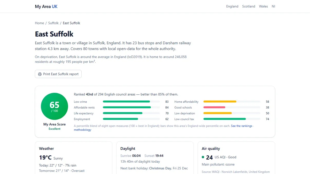
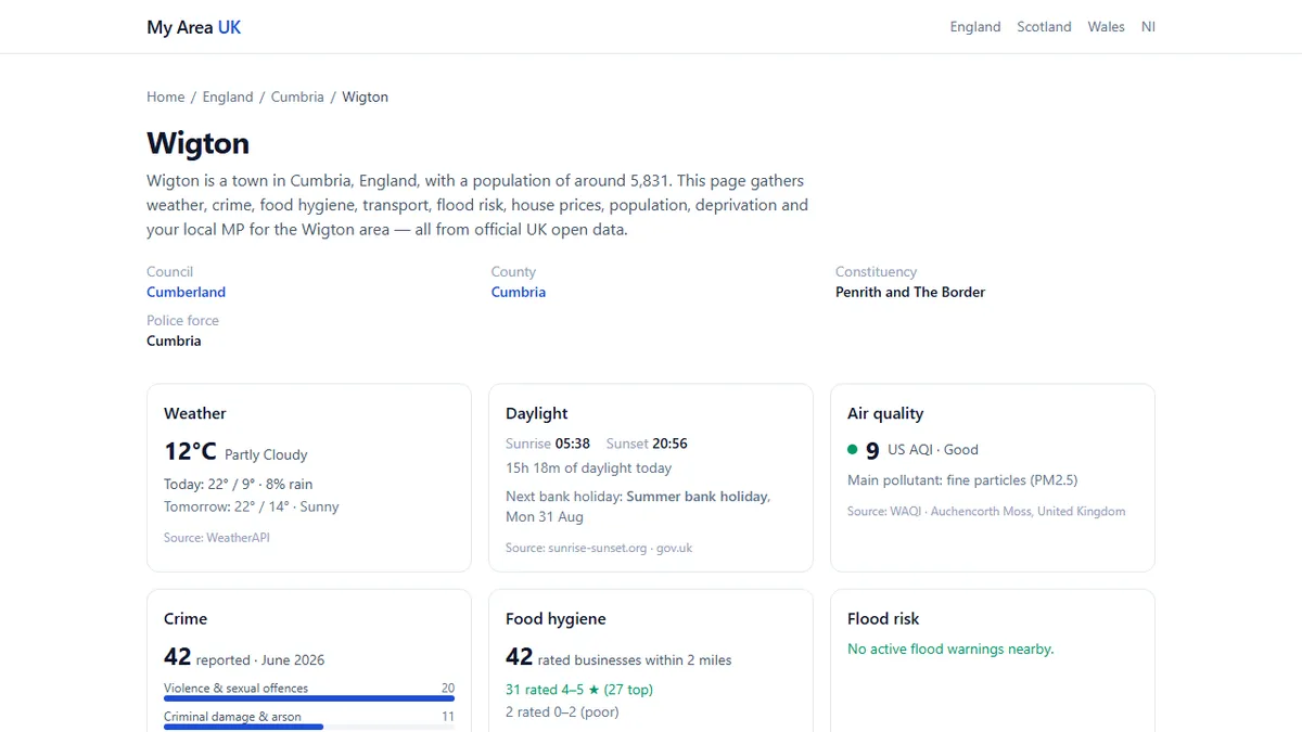
Before you compare two houses, compare the data around them. My Area UK pulls nearby bus and train stops from OpenStreetMap and puts them on the same page as crime, house prices, air quality and fuel prices. That matters because it forces you to look at the neighbourhood as a system rather than a set of photos. A cottage with a nice fireplace and no bus stop within a mile is a different proposition from the same cottage with a stop at the end of the lane. Pull up the town profile for Wigton and you can see its transport panel in the same view as its fuel prices and air quality. The value of this is not the individual number; it is the shape of the place. A town with a station, a supermarket, and a decent air-quality reading supports a different daily life than a village with none of the three.
Rail: the station is only half the answer
Rail is the mode people trust most, and the one they check least. A station on the map is not a service. The transport panel will tell you if there is a station within walking distance; it will not tell you whether trains stop there hourly or twice a day. In London, the panel adds live next-departure times from TfL, which is genuinely useful. Elsewhere in Great Britain, you have to take the stop list and then go to the operator's website for a timetable. Once you have the timetable, apply the commute test: not the fastest journey, but the one you will actually make. If your working day starts at nine, the 8:07 arrival matters more than the 10:34. Check the return too. A line that gets you in beautifully but leaves you waiting forty minutes at 6pm will quietly shape your evenings. Also check the walk from the station to the office, not just the walk from the house to the station. Many people add a bus or a bike to both ends and never count it. A 25-minute train journey can become a 75-minute door-to-door commute without anyone noticing.
Bus: presence is not frequency
Bus stops are easy to see on a map and easy to overvalue. OpenStreetMap will show a stop outside the door, but the dataset has no opinion on whether a bus actually comes. This is the gap where moving decisions go wrong. A stop with four buses a day is not a service; it is a shelter. To make bus data useful, you need the timetable and the operator's route map. Look for three things: the peak frequency, the last bus, and whether Sunday exists. Many people can tolerate a 20-minute wait at 8am but not a 90-minute wait at 11pm. The bus panel gets you to the right questions; it does not answer them. It will also show you whether the stop is on a main road or a cul-de-sac, which affects how safe and pleasant the walk feels. A stop at the end of a dark, unlit lane is a different proposition from one on a lit high street, even if the distance is identical.
Car: fuel prices and the actual route
Driving looks simple until you cost it. The fuel-price panel on My Area UK uses the Competition and Markets Authority's open fuel-price scheme, pulling retailer feeds from participating garages. That gives you a real signal: whether your shortlisted area sits near a cheap supermarket forecourt or only a motorway services. Fuel is a recurring tax on a bad location, and it is one of the few costs you can see in advance. Then drive the route at the time you would actually drive it. Not on a Sunday afternoon. The data will tell you distance and fuel; only a weekday run will tell you about the school-run bottleneck or the level crossing that closes every half hour. If you cannot do a weekday run, at least look at the road on a map and ask whether it is a single carriageway feeding a motorway junction. The answer is usually visible. Also check parking at the destination. A cheap house on the outskirts of town can come with an expensive parking permit at the office, and that cost is not in the fuel panel.
Air quality: the commute you breathe
Commuting is not just time; it is exposure. The air-quality panel pulls from the nearest station in the World Air Quality Index network, so you can see whether the area around your home or your route is sitting at a different baseline than the town centre. This matters most if you cycle or walk to work. A route along a dual carriageway can be significantly worse than the same distance through back streets, and the difference is not visible from photos. Use the panel as a screening tool. If the shortlisted area's air quality is worse than the area you currently live in, ask why. It might be a one-off reading near a building site, or it might be the prevailing wind off the motorway. The data will not tell you which; it will tell you that the question exists. For people with asthma or children, this is not a niche concern. It is part of the commute, and it repeats five days a week.
Compare two shortlists, not two postcodes
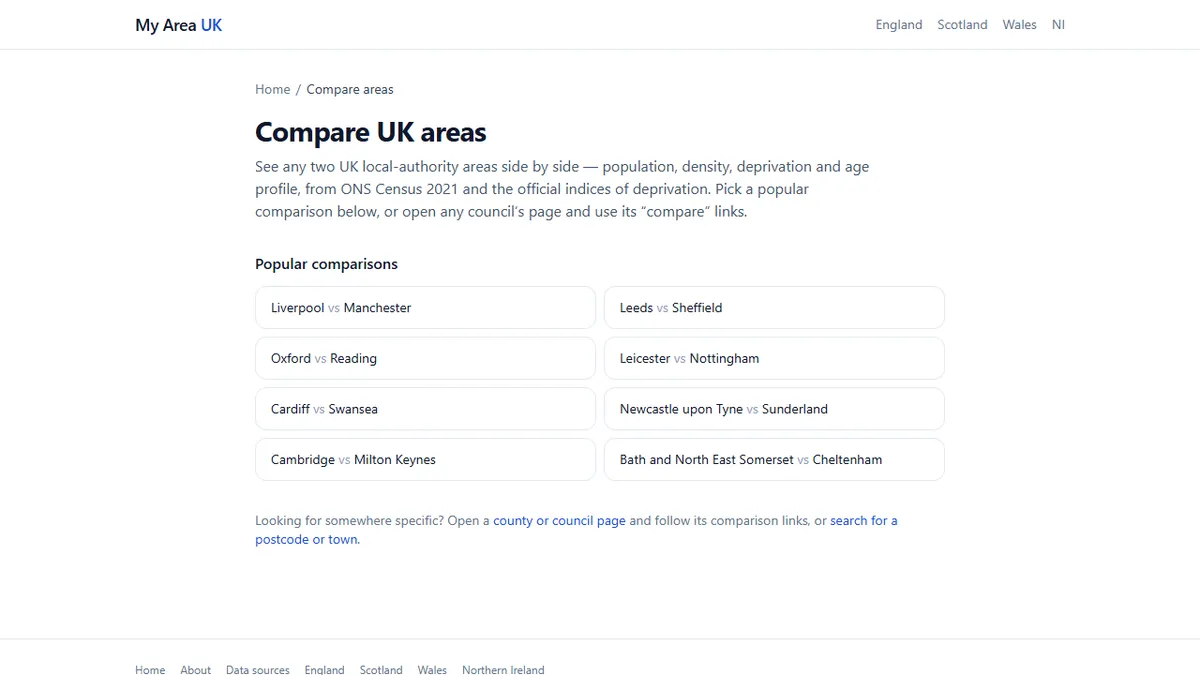
At some point you will have two areas and no way to hold both in your head. This is where the comparison tool earns its keep. You can compare two shortlisted areas side by side on the same fields: house prices, crime, deprivation, transport, fuel, air quality. The point is not to find the area that wins everything. It is to make the trade-offs visible. One area may have cheaper houses and worse air; the other may have better transport and higher prices. You cannot see that trade-off clearly if you are flicking between tabs. Set your non-negotiables before you open the comparison. If you will not accept a commute over 45 minutes, mark that line. If you need a train station, mark that too. Then let the data show you which area fails on the things you cannot flex, rather than the things you can. The comparison also works well for two local authorities in the same county, where the differences are small but the daily consequences are real.
What the data won't tell you
No dataset can tell you whether the 7:14 train will be cancelled on the day of your big presentation, or whether the bus driver will wait for you when they see you running. That is the texture of a commute, and it only reveals itself over time. The data can, however, stop you from making a decision on a fantasy. It can show you that the nearest stop is a mile away, that petrol is more expensive than across the county, or that the air quality around your preferred route is measurably worse. That is enough to move the conversation from 'I like this house' to 'I like this house, and here is what it costs me every day.' The goal is not to find a perfect commute. It is to choose the neighbourhood with your eyes open, knowing exactly what you are trading. A longer drive might be worth it for a garden. A missing bus stop might not be. The data does not make the decision; it makes the decision honest.